


Rebuilt the main navigation of Roto-Rooter’s site, to make the experience more direct and lift clicks on the primary CTAs
- A component that sits on every page of the site needs an experience that holds up

Context
The main navigation is a UI component that is present across the whole site. Getting it right — well drawn, following usability best practice — is what holds the general experience of using the site together.
I took this one on proactively, because I knew improving this component could move real numbers: more clicks on scheduling and calling, and more clicks on the location qualifier. That last one matters more than it sounds. Qualifying the user’s location is a critical mechanic in Roto-Rooter’s system — it is how the site can offer the right services for that address, the coupons that apply there, and the rest of the content aimed at that customer.
Problem
This component touches the heart of the site. I took on the risk that changing it could feel strange to people who knew the old one — but I was convinced that, over the long run, these corrections would improve the experience of the whole site.

Solution
The idea of the deck was to show the usability problems the site’s navigation had, and how to correct each one. Looking at some competitors and applying the design best practice named alongside every finding, I landed on seven items that could significantly improve the experience of using the main navigation.
The method for deciding what should be redone was reading: articles on navigation, on reading, on the use of white space and on design best practice — plus my own general knowledge as an experience designer. Every finding in the deck carries the sources behind it, among them the Nielsen Norman Group, the Baymard Institute, Smashing Magazine and a peer-reviewed study on letter case and legibility. What came out of it:
Three horizontal bars → excessive cognitive load
Complex navigation menus contribute to high cognitive load, and a UI that demands too much cognitive effort is one people abandon.

CTA placement → direct impact on conversion
When the primary action buttons sit in a lower tier of the navigation, high-intent users struggle to find them. Every extra step between intent and action adds risk of drop-off.
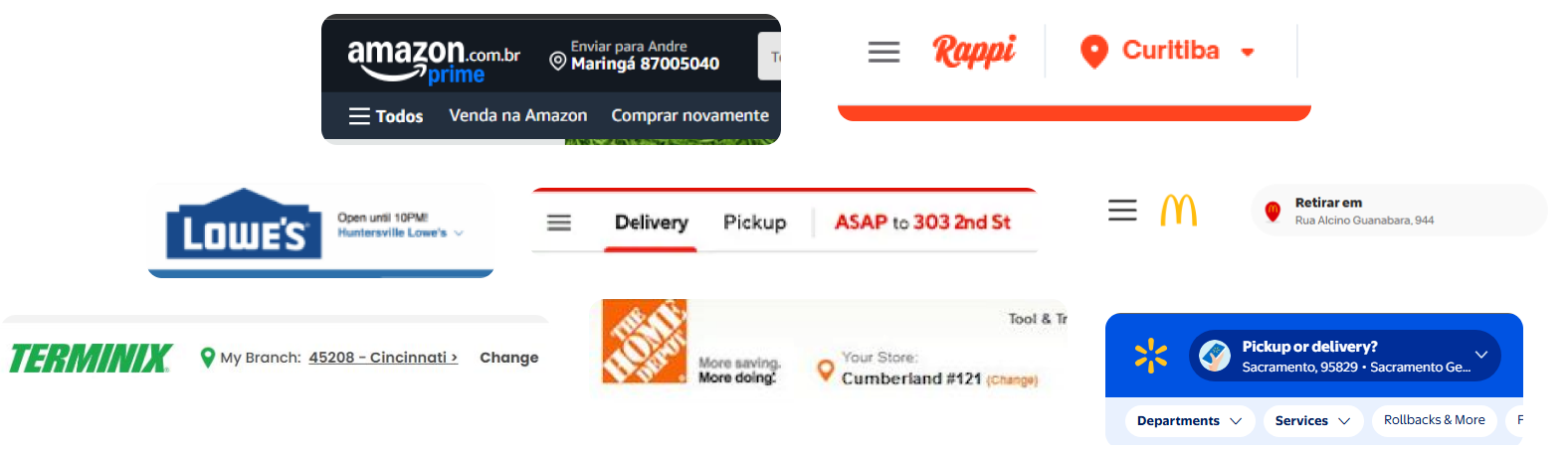
On the location switch specifically, the major players — Amazon, McDonald’s, Walmart, Home Depot and others — place this button next to the logo, to make an important action easier to reach.

Oversized header → loss of space for the page content below the menu
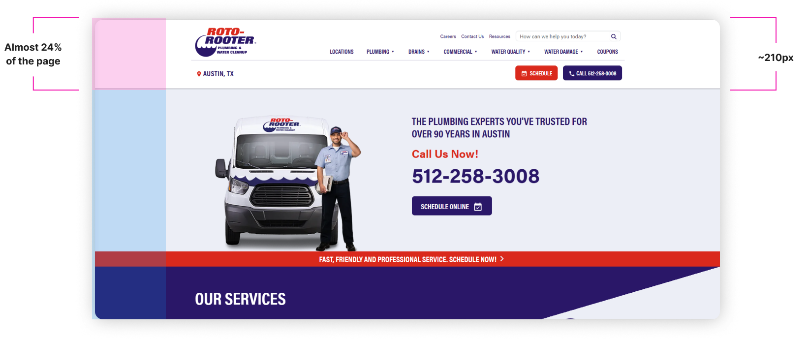
At roughly 210px, the header was eating almost 24% of the page and pushing content under the fold — on every single page.
Bold and all caps on every label → visual hierarchy breakdown
Maximum weight and uppercase on everything is uniform visual noise: all caps slows word recognition by forcing letter-by-letter reading, and when everything is bold nothing stands out.

Promotional content in the primary nav → diluted service discovery
Coupons sat in the same row as the service categories. Mixing promotion with core navigation breaks the user’s mental model — someone scanning for a service trips over something that belongs in another context.

Search placeholder far too long → unnecessary visual noise
“How can we help you today?” asks for a lot of reading, when the job of the field is a search. So I left just “Search…”, which is more direct and says what the field does.

Excessive header padding → wasted viewport real estate
White space is a powerful tool, but only when it is intentional. The way it was being used here, we were losing a lot of room in a disorganised way.

The new design
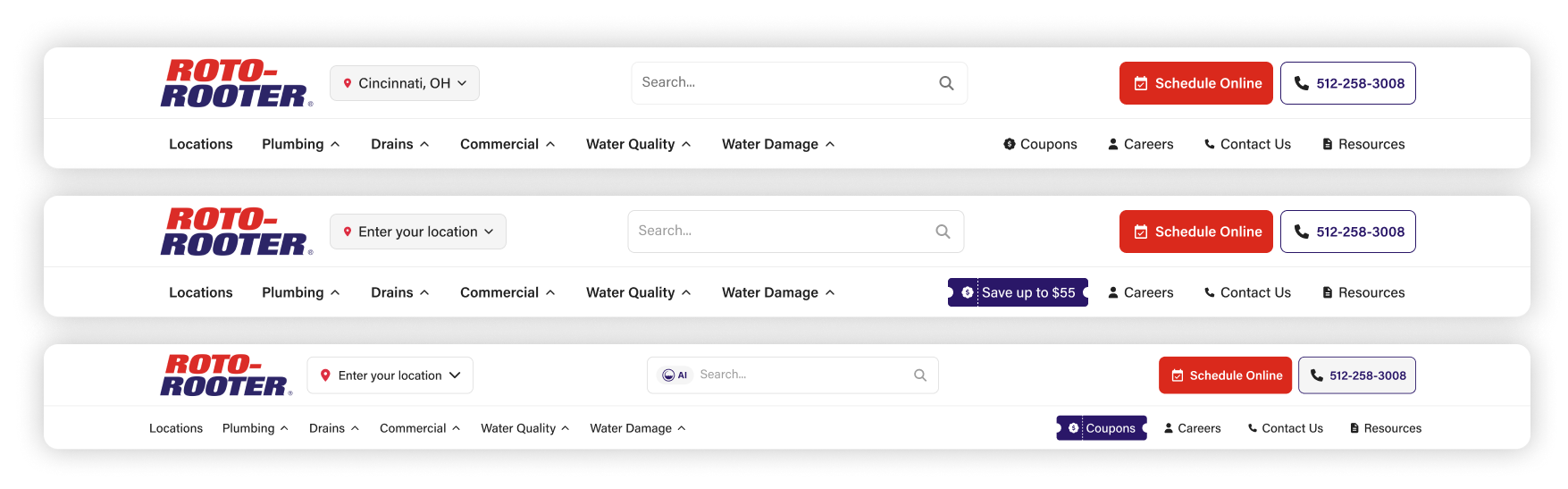
This was the new version, the one that answered every problem raised. Point by point:
- Three levels of menu became two. The content is the same, now with one row less.
- Every button moved up to the first level of the menu, in a clearer order of importance: the search field better placed, Schedule Online as the primary action and the phone number as the outlined, secondary one — both where someone who arrives ready to book will look for them.
- The location picker went next to the logo, with enough affordance to read as a clickable area.
- The header lost about 55% of its height, handing that space back to the content of every page.
- Buttons and menus moved to sentence case, so weight and case can go back to doing what they are for: signalling what matters.
- Coupons moved next to the support menus — Careers, Contact Us, Resources — instead of sitting inside the group of service categories.
- The placeholder became “Search…”, which works best.
- The unnecessary white space came out, leaving the padding that is actually doing a job.


More visual weight on the coupons menu
Moving Coupons out of the service categories fixed where it sat, but not how much it weighed. So I drew options that give it more visual load and make it obvious that it is a menu of its own — a ticket icon, a filled treatment, and a version that states the offer outright.
Mobile
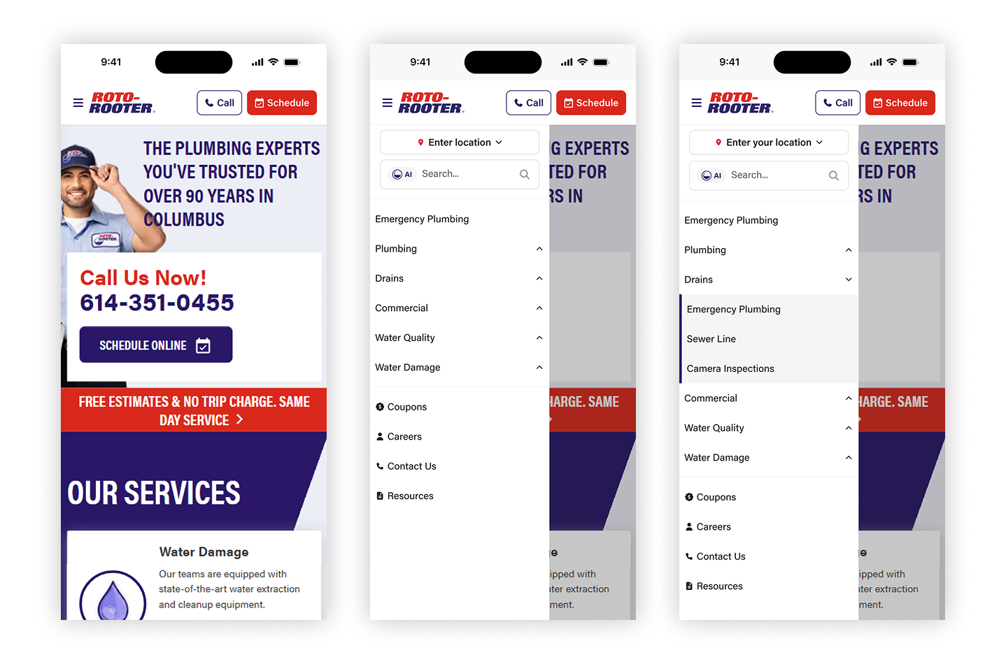
On a phone the same rules apply, with less room to apply them in. Call and Schedule stay visible in the bar at all times; the location picker and search sit at the top of the panel, before the menu; and the service categories expand in place, so nobody loses their place going one level down.
Conclusion
I presented this project as an improvement proposal to Roto-Rooter’s national leadership.
It has not been built so far — there were other priorities in the development pipeline — and I have no visibility into its execution. So this case carries no numbers on the metrics it set out to move, and none of the problems the implementation would have surfaced.
What I liked most about this project is that, for all the changes, every feature and every piece of content stayed. We lost nothing, and gained a great deal in design quality.
Had I been able to carry it on, I would have run A/B tests with different versions to see which components perform better — the coupon treatment, for one — and compared the metrics against the old menu: clicks on the CTAs, interactions with the service menus and with the support menus. That is what would tell whether the change was a real improvement.