


The online scheduling form’s completion rate rose 13% after cutting the number of steps, adding new features, and refreshing the interface’s visual design.
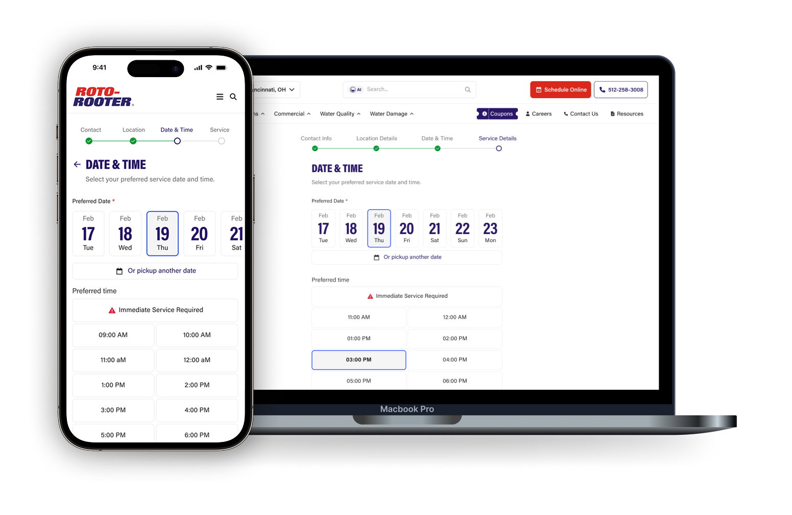
Context & Outcome
Context
Roto-Rooter is a leading plumbing company in the United States. To book a service, a customer can call the phone center or book online.
The online scheduling form had been built a few years earlier and never revisited since. Besides not following best practice, this design showed a 27% drop-off rate by the end of the flow.
Outcome
After 15 days in production.
Conversion rate
Error rate
Time-to-task
Flow walkthrough
Design process
I ran this process across six steps, always validating decisions with data and the product team.

Define success metrics
We defined the key metrics to measure whether the changes would actually improve the experience and the solution's performance.
- Definition of the key KPIs
- Alignment with business goals
- Establishing criteria to compare versions

Identify critical problems
We started with the most obvious UX and UI problems, points that were clearly hurting the experience and needed to be fixed right away.
- Review of the current experience
- Identification of conceptual and visual problems
- Prioritization of the most critical problems

Explore design directions
With the main problems mapped out, we explored different solution possibilities and references to define a new design direction.
- Search and analysis of references
- Exploration of different approaches
- Definition of the initial concept

Align with the client
We presented the proposed direction to the client, explaining the design decisions and validating the path before moving forward.
- Presentation of the proposal
- Discussion of design decisions
- Collection and incorporation of feedback

Evolve the design
We refined the existing components and created new patterns and variations to support the new experience.
- Review of existing components
- Creation of new components and variations
- Application of the patterns across the flow

Measure and compare
We tested the different versions to understand which solution performed better against the metrics defined at the start.
- Comparison between versions
- Data analysis
- Identification of the best-performing version
Critical visual changes
Each change here solves a specific problem, grounded in usability heuristics and accessibility best practices.

Contrast and color use
Modernization and new features
New components and tweaks designed to make the flow faster and more modern.

Informative banner
Usability testing
To validate the decisions before locking the final version, I tested the prototypes with 7 people from different age groups, aiming to represent the real audience booking a plumbing service, from people already comfortable with technology to those who aren’t.

Progress
- Designed three progress variations (stepper, spinner and tag) and tested them on mobile and desktop.
- The spinner did well on mobile but performed poorly on desktop.
- Went with the stepper for its consistent performance across both.

Fields
- Asked whether the field grouping made sense and whether anything felt missing when requesting the service.
- Feedback was consistent: the fields asked for were the ones needed, with no gaps noticed.

Navigation
- Mapped scenarios for moving forward, going back and handling errors while filling out the form.
- Checked whether the flow felt intuitive from start to finish.

Visual perception
- A more qualitative question: did the new layout feel more modern and visually pleasant than the previous version?
The feedback was folded into the final adjustments, and the resulting version was handed to the development team for integration and release.
My learnings

What I learned
- Not every decision is settled by technical logic, part of the job is negotiating well when a recommendation gets rejected.
- I learned to tell apart what compromises usability from what’s just client preference, and to yield professionally when that’s the right call.

What I would do differently
- I’d look for access to more analytics data to identify problems more independently.
- I’d A/B test the hypotheses that didn’t make it in, like reordering fields, to validate impact with data instead of argument.
- I’d expand usability testing to more participants.