


Built the app that became the sales team’s right hand
- Commercial intelligence, in the hands of the shop floor
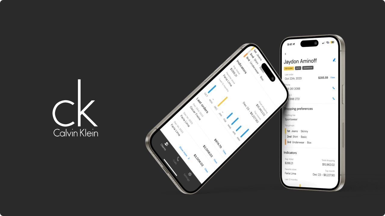
Context
Calvin Klein is one of the leading global fashion brands. It is run by PVH — also behind Tommy Hilfiger, Van Heusen and IZOD — and holds more than nine billion dollars in revenue with 36,000 employees. In Brazil the brand reaches more than a thousand cities, through 3,300 multi-brand stores, 42 of its own and 58 licensed ones.
Intro
This product is a mobile application, on iOS and Android, built for the Calvin Klein Brazil sales team.
The goal was personalised service. The app hands the sales team the information they need to get a real grip on a customer’s preferences, and to serve them accordingly.
Problem
Calvin Klein values exceptional customer care. Customers enjoy the personal attention of a salesperson who knows their preferences and can make a recommendation worth hearing. But when that salesperson is not in, the rest of the team has no way of picking up where they left off with the same personal touch and the same amount of information that salesperson had — service backed by more information, for the whole team, could hold the high standard the brand demands.
There was a second need on top of it: the information had to arrive in as few interactions as possible. Anything that kept the seller stuck on a screen could give the customer the sense that they were not getting the attention the sale deserved.
Solution
We built an application integrated with Calvin Klein’s ERP. Through it a salesperson can see a customer’s purchase history, along with their clothing preferences and buying patterns. Any salesperson can reach that information, and help the customer towards a purchase that matches their taste and their budget.
Alongside the integration, we identified the need for a call list — pulled from an endpoint on the Calvin Klein ERP — for the sales team to work through. The intelligence behind the list is controlled entirely by the ERP and refreshed daily. Staff call or message the customers on it, and log the outcome of each interaction back into the app.
Process
The design work ran in three phases.
1. Design sprint
- Identifying and creating the personas. Detailed personas of the target users, as the foundation for understanding their needs and behaviour through the rest of the process.
- Defining the MVP across stakeholders. Features and functionality prioritized against the interests of several different stakeholders, to land on a product that answers the key needs and is still feasible with the resources available.
- Low-fidelity prototyping of that MVP, to make the shape of the product visible and arguable before committing to detailed design.
- Testing and validating with potential users, so the assumptions in the MVP met real reactions early.
- Redefining the roadmap on what the testing returned — reordering priorities, revisiting features, and making the strategic calls that followed.
- Identifying and classifying the project risks, and mitigating them before they could reach development.
- Mapping and optimising the user journeys, to find the friction points and smooth the path through them.
2. Usability testing
Run with the official product in the hands of the sales team, in the context they actually work in.
3. UI and UX changes
Made against the feedback that testing produced.
Across the three phases we gathered what salespeople, store managers and directors expected, what they needed, and what would make the product genuinely usable for the people on the floor.
UI decisions
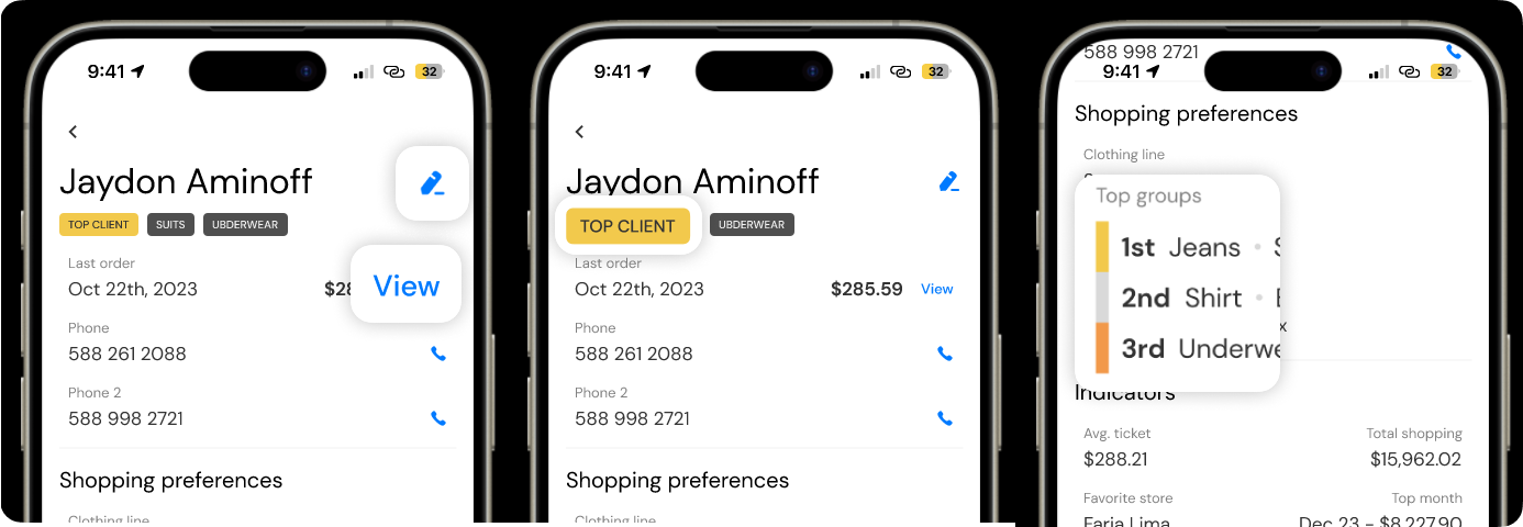
Calvin Klein is known for simplicity of color and a minimum of visual elements in its communication. The palette follows the brand for that reason, and color outside it appears only where something has to be picked out: an important action, or a piece of information that matters to the service being given.
The flow was kept deliberately short — few screens, so the information is quick to reach without adding noise to the conversation with the customer.
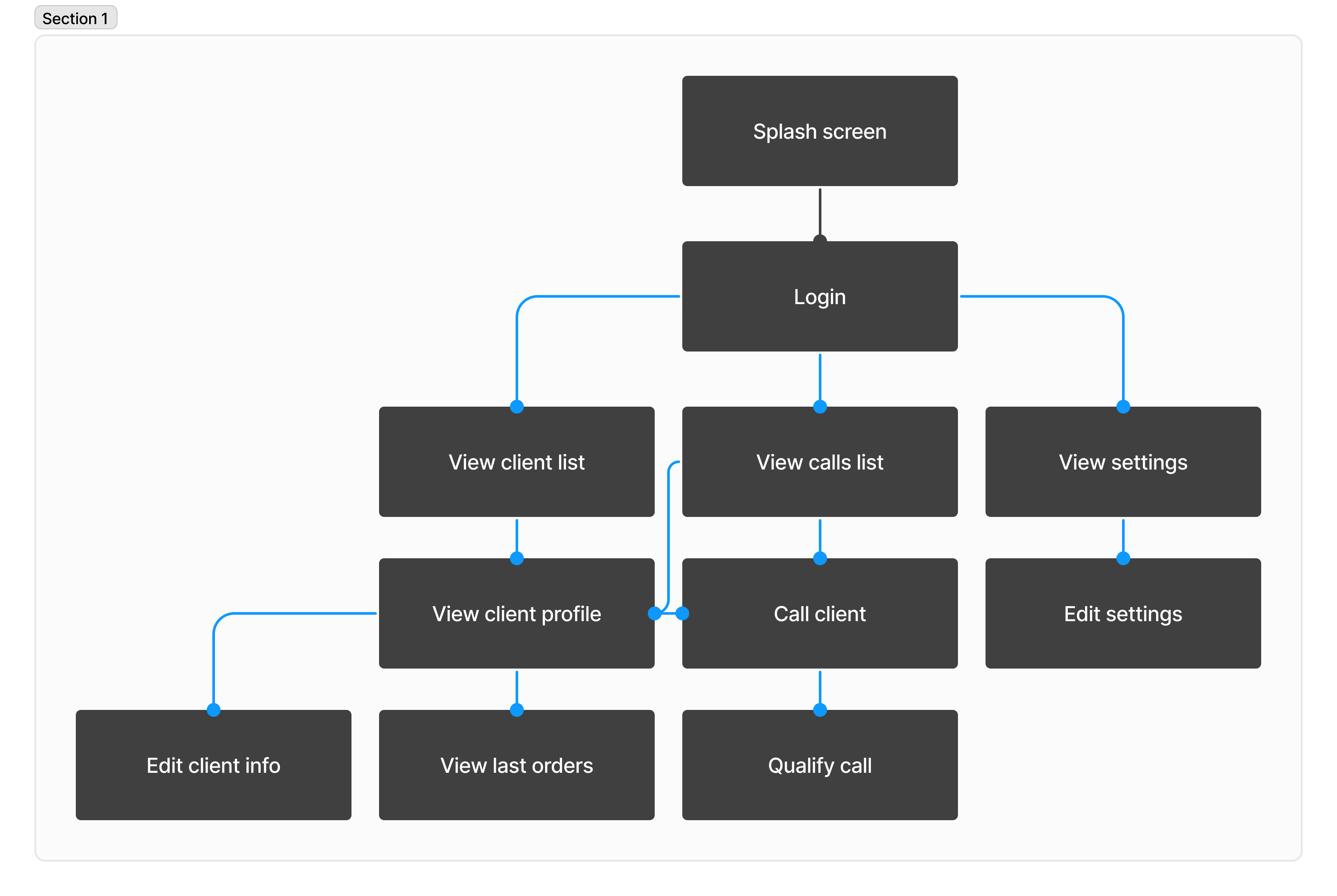
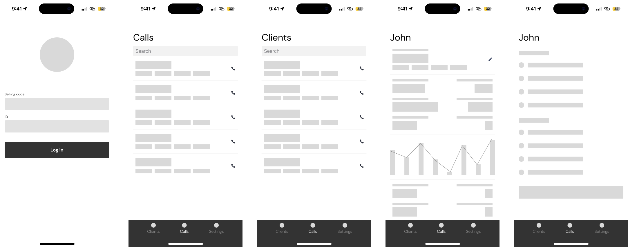
Working from those premises, we drew the mind map first, to understand every screen the app would need, and then a low-fidelity design. That low-fidelity design was discussed with a sales team until we landed on a satisfying set of interactions and the information that had to be on screen.
What came next
After that first build, we ran two further monthly iterations, picking up the improvements salespeople and managers had run into in daily use — a better experience for the sales team, and through them for the customer at the counter.
Those iterations produced two more versions with the improvements implemented, and the app was handed over to CK Brazil to look after from there.
Results
Getting the store teams to adopt a tool that changed how they worked was its own hurdle, and one the project had to clear. With that covered, the sales force gained:
- Personalised service.
- Higher customer satisfaction.
- A higher lifetime value from those customers.
- A more organised, better-optimised working day.
The app became the right hand of sellers in the brand’s stores in Brazil and abroad. It makes personalised service possible at scale, because it puts the relevant information in front of the seller at the moment it matters.